Okay. Sometimes, I can be quite biased.
Just because I’m a copywriter, I tend to dismiss the other critical element of a great piece of marketing communication – the visual. Hey you can’t blame a writer who is defensive of his craft.
So why this sudden affinity towards visuals? Well you can’t refute facts, especially when they make a whole lotta sense. According to research by some geniuses, it is proven that:
People remember 80% of what THEY SEE
Compared to only 20% of what THEY READ
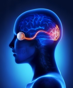
Pretty eye-opening stat, if you will. But it doesn’t take a genius to figure that one out. I would most likely remember the opening scenes of my favourite movie as opposed to the opening lines of my favourite book. Yes, we humans are intrinsically wired to prioritise visual information.

So that’s how people consume data, but here’s the more important stat part of the same research:
90% of the world’s data was created in the last 2 years.
Yes, the last 2 frigging years! And we all have access to virtually most of it thanks to accurate search platforms and social media.
So what does this mean for developing marketing communication content?
1. Target
Find out everything you need to know about your audience
2. Focus
Don’t ramble, keep it simple and concise; made easy when you know your target
3. Visual-ise
Take on an infographic mode wherever possible; icons, charts, graphs and illustrations
In essence, don’t add to the mindless drivel that’s growing exponentially every second. Say enough to evoke curiosity, compel action and you’re done.
The sad thing is, apparently only 28% of words in a webpage are actually read, which means 72% of this post just added to the mindless drivel.

No comment yet, add your voice below!